
La Casa de Las Calacas
Background
When I was employed at PrintandPixel.com, I took part in a “studio portfolio” project meant to produce examples of our various skill sets as designers that we could show our clients. The project requirements were that we design branding for an imaginary restaurant and show how the assets we produced could be applied to various deliverables. My project partner Jai Fujimoto and I thought it would be fun to do a Día de los Muertos themed taco dive bar.
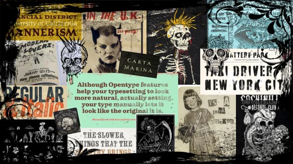
Above: My La Casa de las Calacas moodboard.
Visual Identity
To appeal to our theoretical Austinite audience of community/local oriented, progressive 30 to 50 somethings, my partner and I decided to add some punk and nostalgia to our theme. After gathering visual research from a variety of Austin dive bars and Día de los Muertos themed restaurants, I began work on some stylized illustrations to find a suitable visual identity. After making a ranked list of prominent Día de los Muertos iconography, I started with a punk Catrina for the logo and developed additional assets from there. American traditional tattoos (which I have designed for friends in the past) were another source of inspiration.
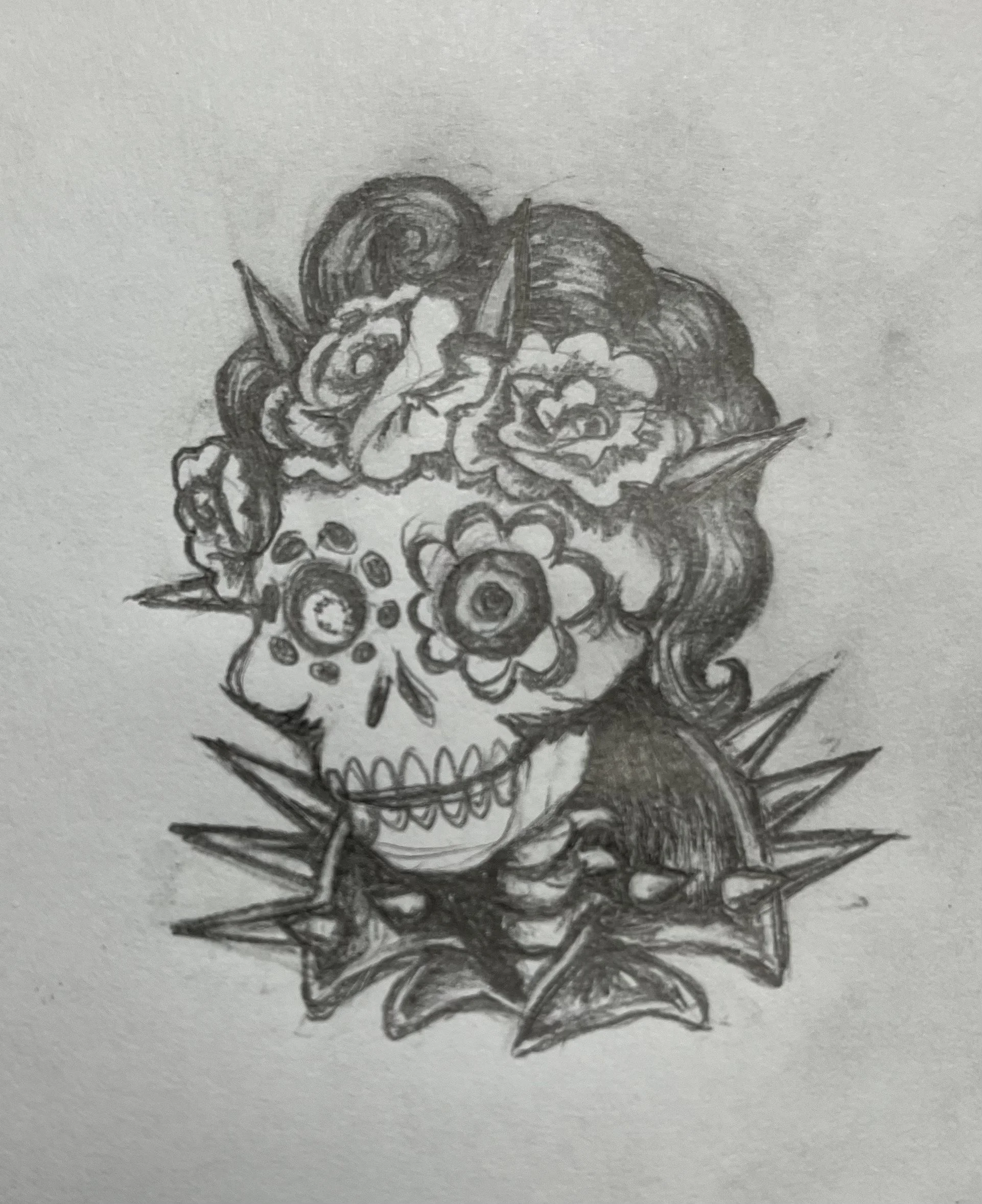
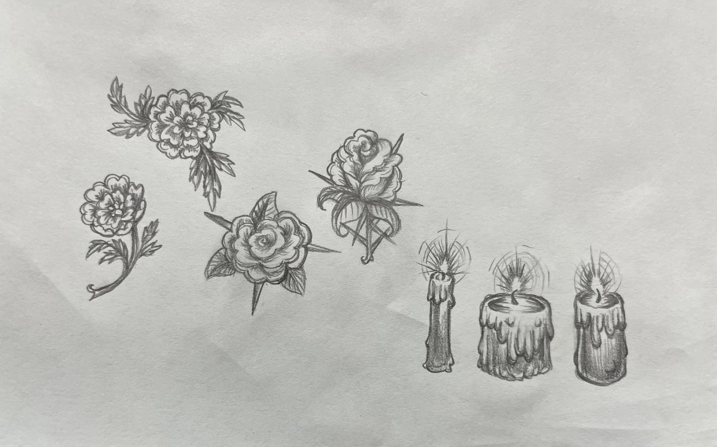
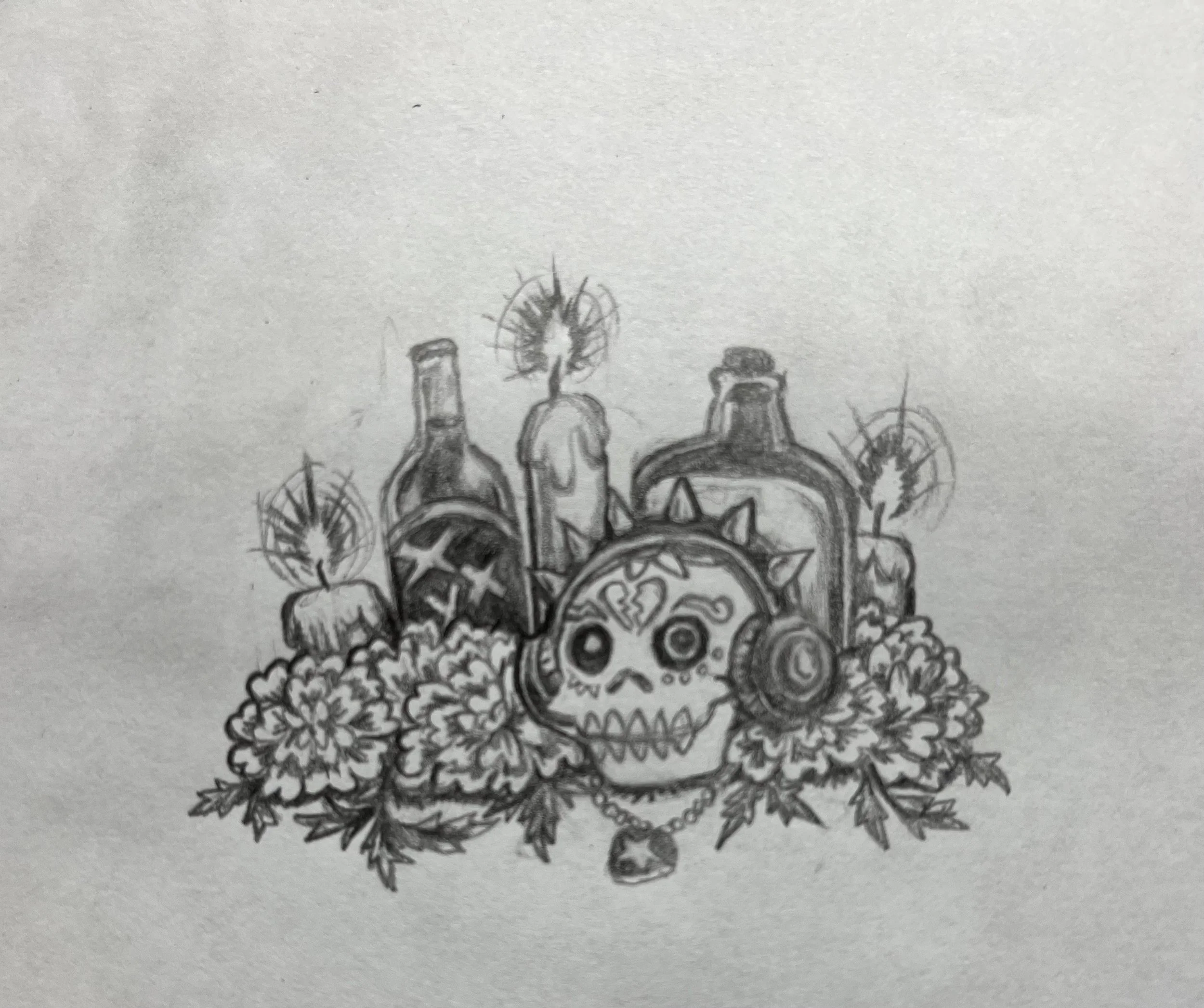
Above: My hand drawn illustrations for the La Casa de las Calacas logo, decorative elements, and sticker.
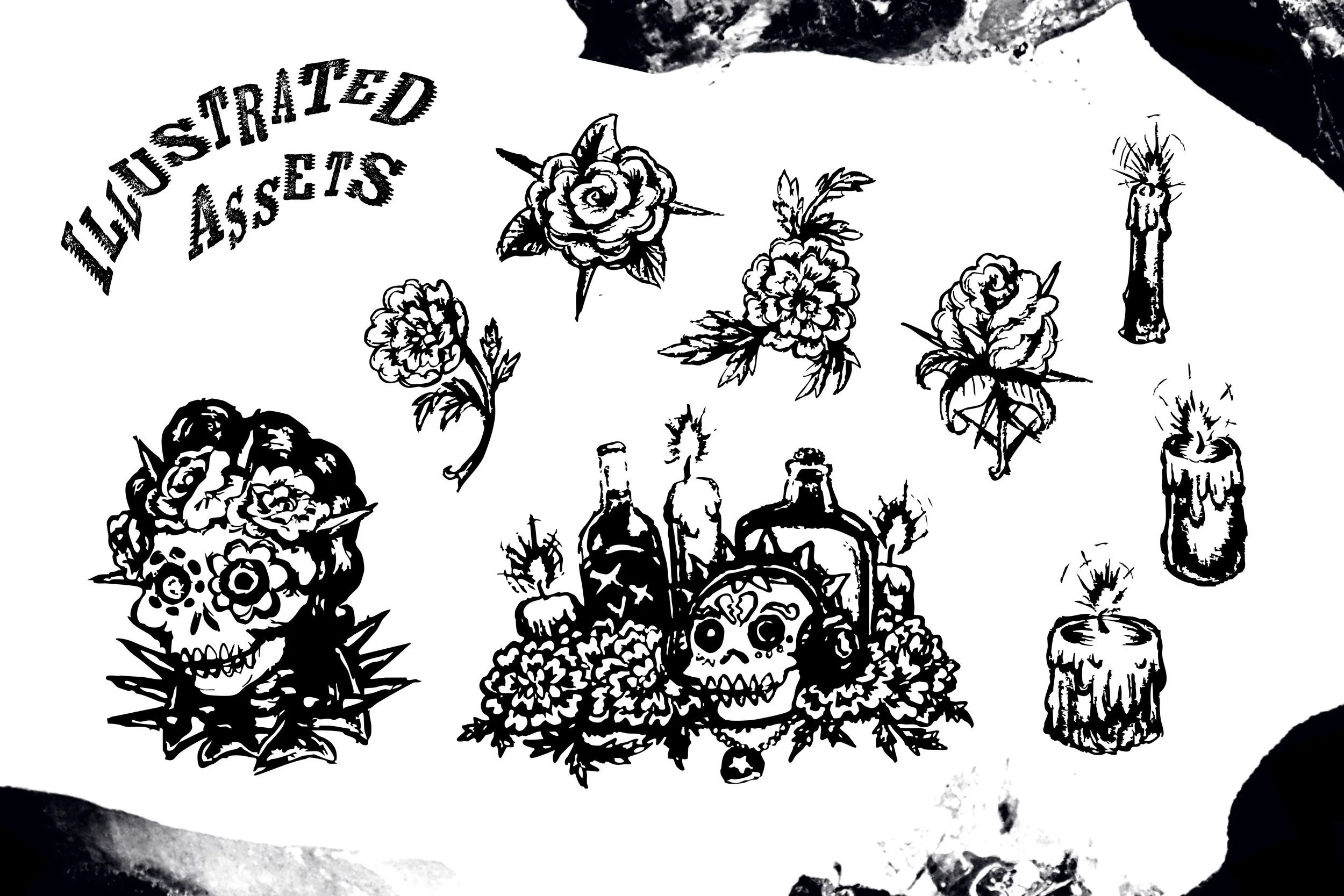
Above: Finalized illustrated assets after being image traced and edited.
Logo Development
With a visual identity set, I started developing our logo. I knew that this brand would require many logo variants, something that would look good on everything from a T-shirt to a website, so I explored different ways to orient text around my punk Catrina design. The illustration was an irregular shape so it not only made sense to make the type similarly irregular, but it also matched our theme. A grungy cowboy typeface like Kiln paired well with the Tex-Mexness of our theme and dive location, and drawing from the punk side of our theme, I distorted the characters so that they would be somewhat reminiscent of punk zine typography.
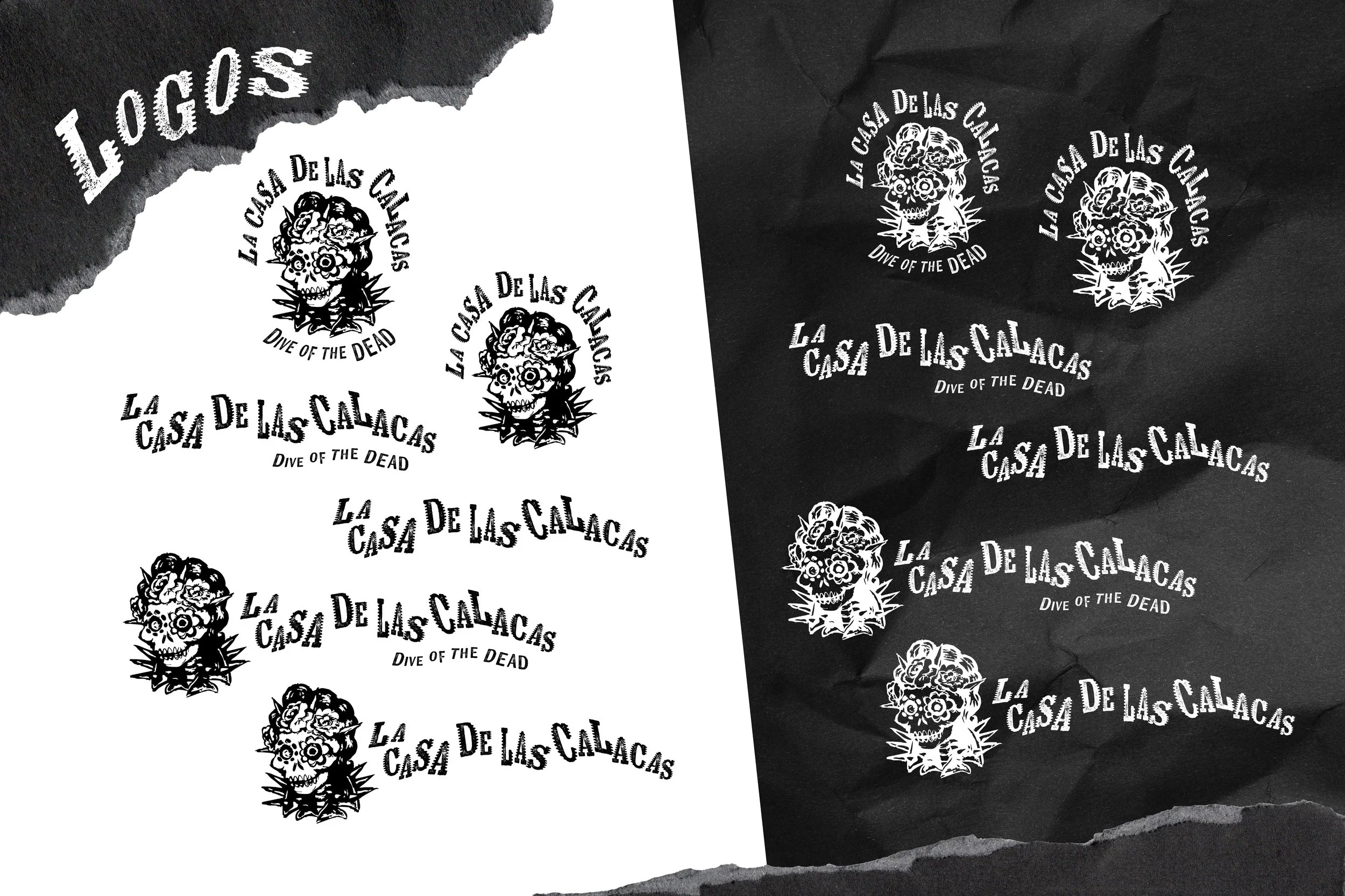
Above: Logo variants for La Casa de las Calacas. The Catrina illustration in the white-on-black variants was edited to make it slightly more legible.
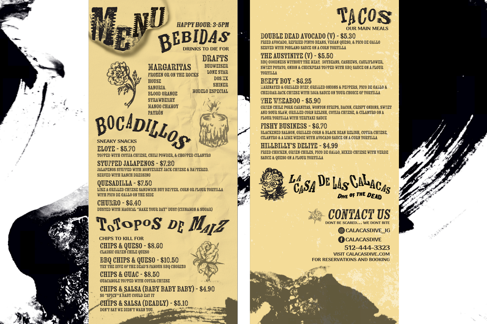
Above: Mock dive-bar menu. Jai designed the layout and shaped the voice of our brand through her work on the menu items. I edited the section titles using the same technique I used to design the logo.
Asset Application
With the main assets of our brand developed, my partner and I moved onto application stage of our project. Jai took my illustrations and typeface choices and used them to design a menu, while I made mockups for stickers and a t-shirt. Seeing how Jai used my assets gave me a simulation of how a client or in-house designer might use them.

Above: La Casa de Las Calacas mock stickers. These could be placed on sticker walls around Austin as a form of advertising.

Above: La Casa de Las Calacas mock t-shirt demonstrating the utility of having an illustrated vertical logo variant.
Conclusion
This project was a good opportunity to test and mature my teamwork skills. I ended up doing most of the initial brand development due to my partner facing schedule interference with other projects, so the biggest lesson for me came from seeing how my illustrations, type and design choices would transfer over to her with limited time and without a brand guide. Some assets were easier for her to use than others, but I ended up having to do all typography distortions for the project because they were unintuitive for her to replicate. This taught me the value of having process based instructions for more complicated tasks even for small, short-term projects.
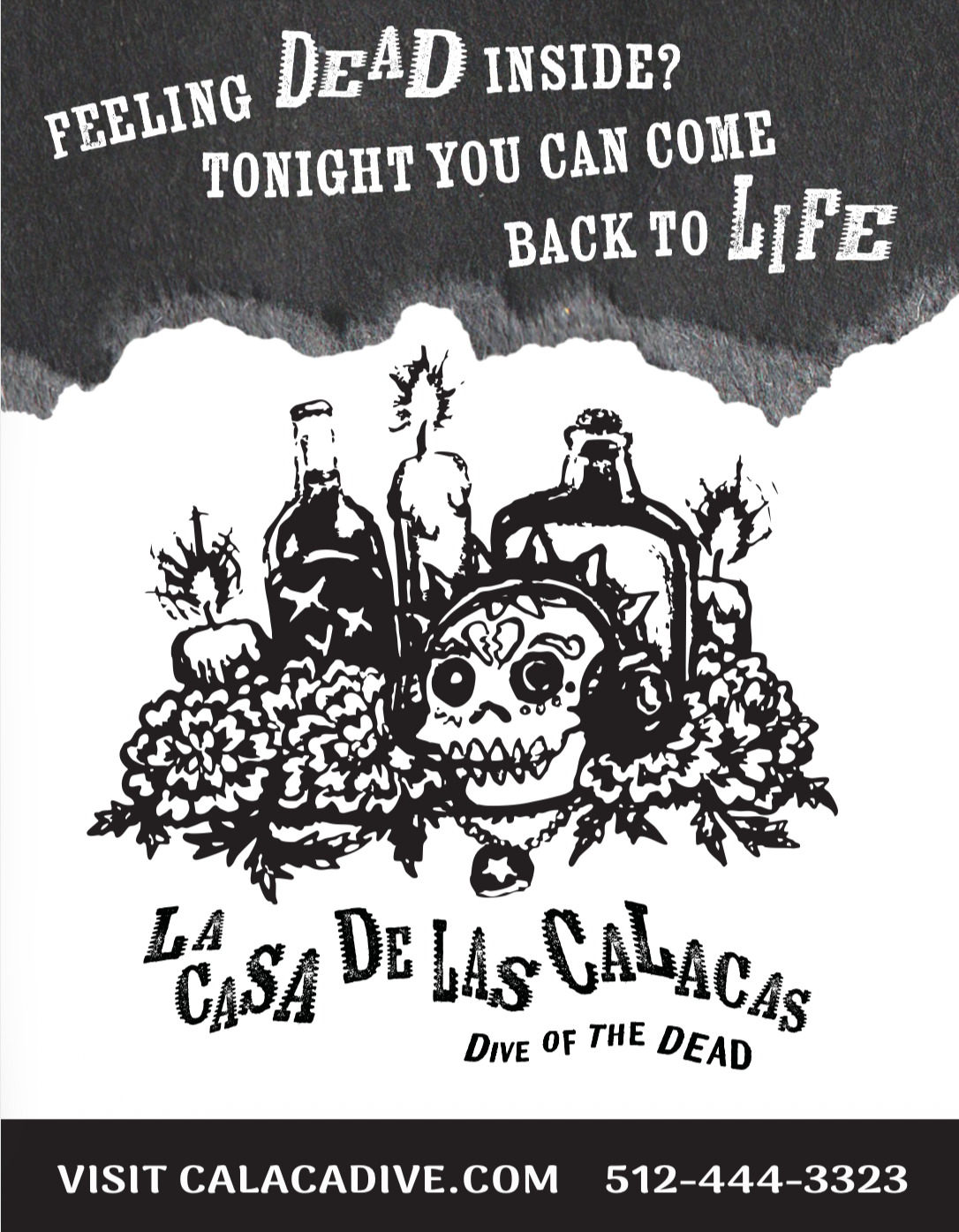
Above: La Casa de Las Calacas print ad mock-up.