
Site-Exit
Background
When I was working at PrintandPixel.com, logo redesigns were a common assignment. Occasionally those jobs would turn into larger brand design projects, and my time with Site-Exit represents a unique example of this scenario. The client came in searching for a scalable re-creation of his logo, but a more in depth conversation revealed that he was looking for help with the development of his brand’s identity.
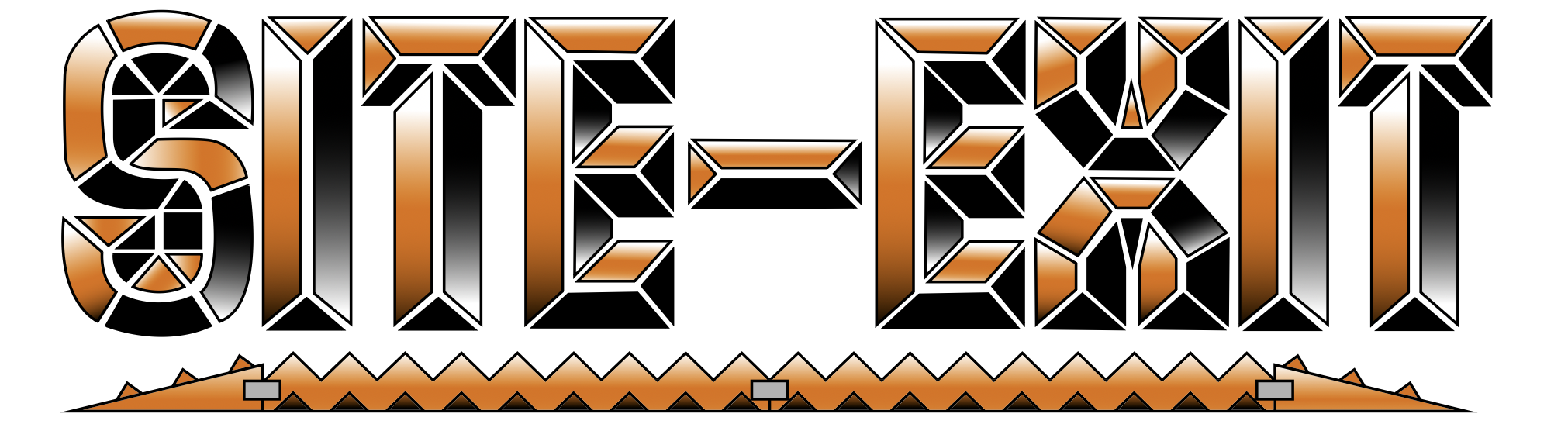
Above: My client’s logo, prior to logo exploration and re-design process.
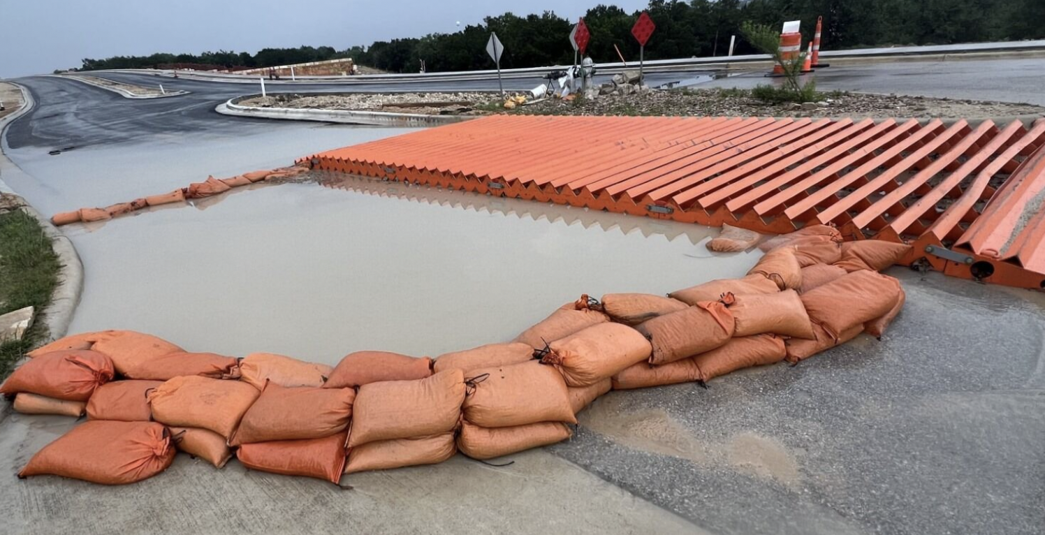
Above: My client’s product. An alternative to construction site mats, vehicles drive over it to remove sediment from their wheels when leaving work sites.
Research
My client’s brand needed to communicate three things: that his product was secure, reliable, and environmentally friendly, that it represented the future of it’s industry, and that the brand was people and community focused. My client also preferred for there to be a somewhat playful element to the brand, a kind of “cops and robbers” framing of their product’s role in gatekeeping “fugitive sediment” (as it is called in the industry) from entering communities from construction sites. As well, something he really liked about his initial logo design is the way it mimicked the mechanical motifs of his product. I kept those notes in mind as I went into logo exploration for the Site-Exit brand.
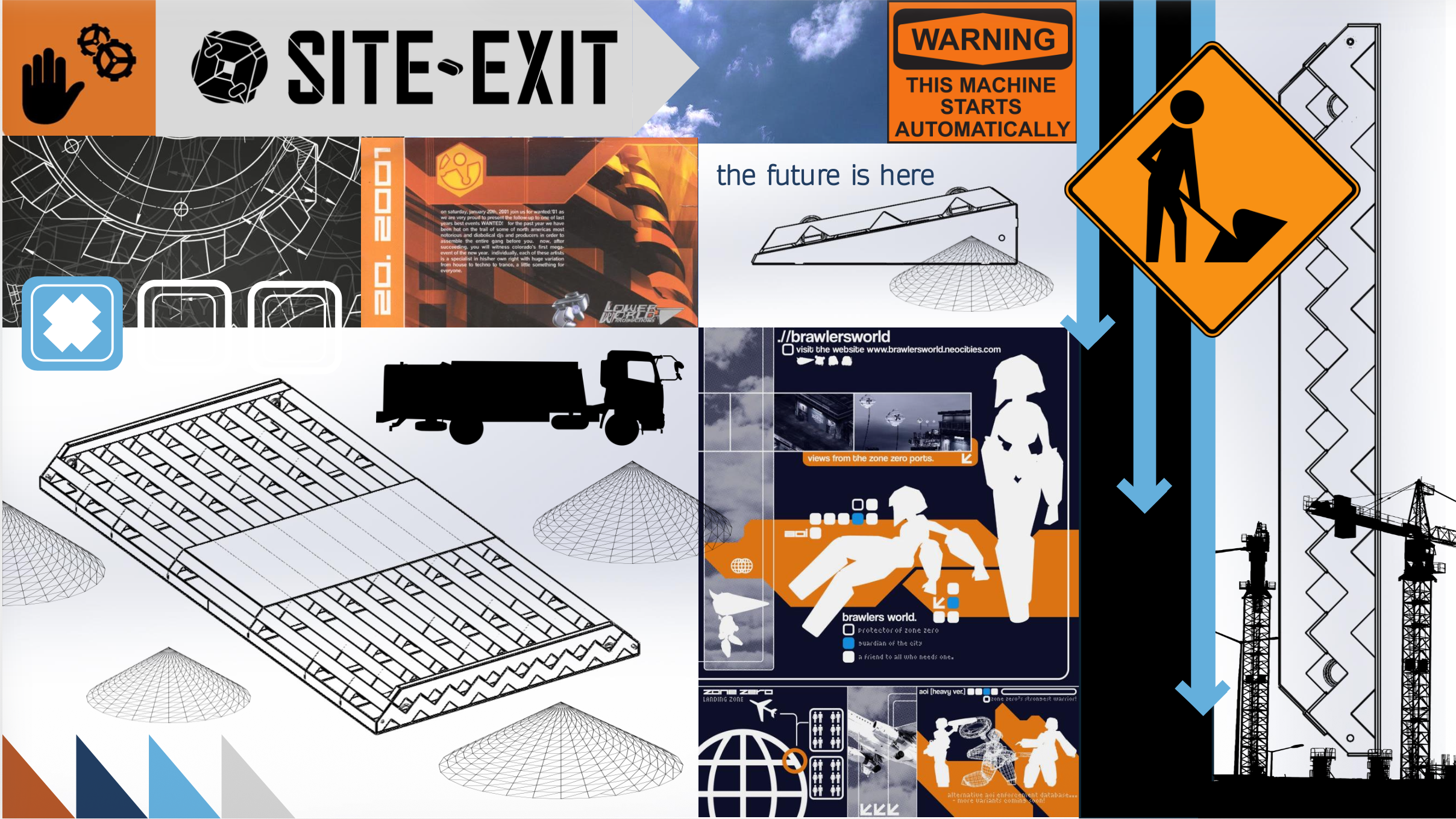
Above: Site-Exit brand exploration moodboard
My competitive analysis yielded a list of common construction industry branding motifs. Firstly, the usage of safety colors (like yellow and orange) and dark blue among larger construction brands to suggest authority, security and dependability. There was also the usage of diagrams to present products as state-of-the-art, scientifically proven tools. Aesthetically, I also discovered trends like product-element incorporation (my client’s original logo was very much an example of this trend) and 2000s to 2010s era technological and environmental optimism. These tropes were particularly applicable to my client’s brand, and influenced how I went about re-designing my client’s logo.
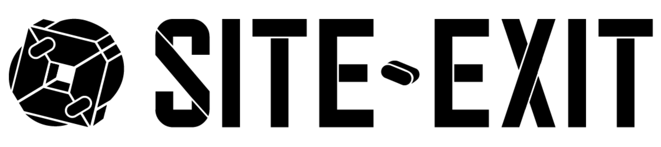
Above: Site exit logo re-design concept.
Brand Direction #1
The first element of the brand exploration and re-design process that I tackled was the logo. Turning the complicated display font of my client’s original logo into a construction site sign inspired sans serif seemed like a good way to make the brand legible and recognizable, while also adding some non-industry-standard quirks that stayed true to the originality of my client’s initial logo design. I translated the mechanical mimicry of the product in the original logo into futuristic overlapping grid lines to represent the brand’s ambitions and promises, made it easier to decipher at a glance, and changed the literal representation of the product in the original logo into an abstract shape based on the mechanics of the initial product, yet kept it vague enough in form to evolve in meaning alongside the business if it were to expand it’s products and services.
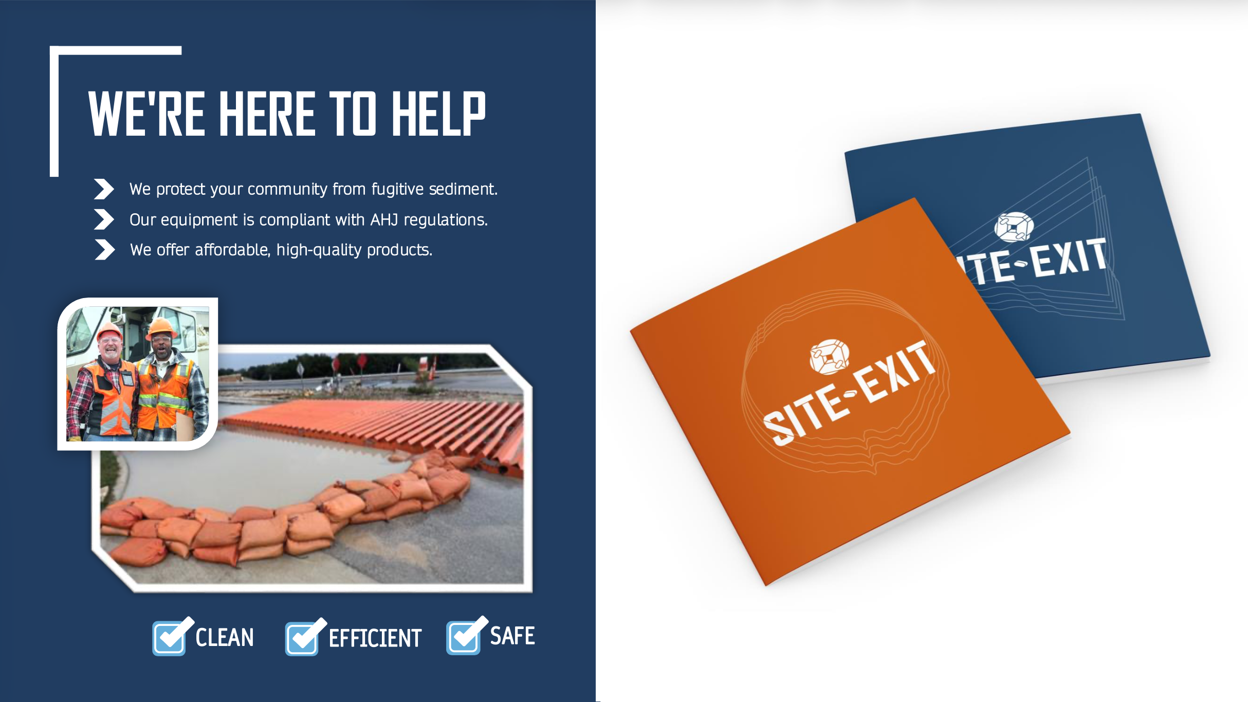
Above: layout and branded materials mock-up
Then came the mockup phase of the project where I showed my client how the logo would look in use and began to explore the kinds of typefaces and other graphic design elements that would match my visual direction. The abstract mechanical object that I created for my logo began to take on a more symbolic meaning, as demonstrated by the two booklet covers I designed as well as the shape language of the framed photos in my layout mockup. Orange across construction brands is associated with safety objects and people, the warm humanity behind construction projects, so the round and circular are motifs that I decided to associate with it. In contrast, blue in the construction world is a symbol of authority, the ability to cut past obstacles and lead, so I associated it with sharp, angular motifs. Together, they formed a balanced sword and shield dichotomy for the brand’s visual identity.
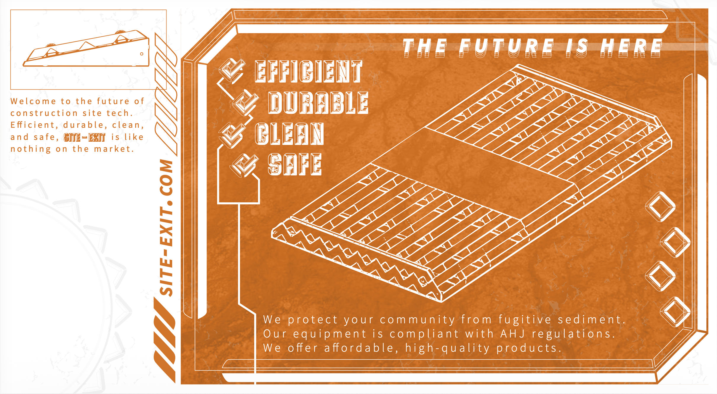
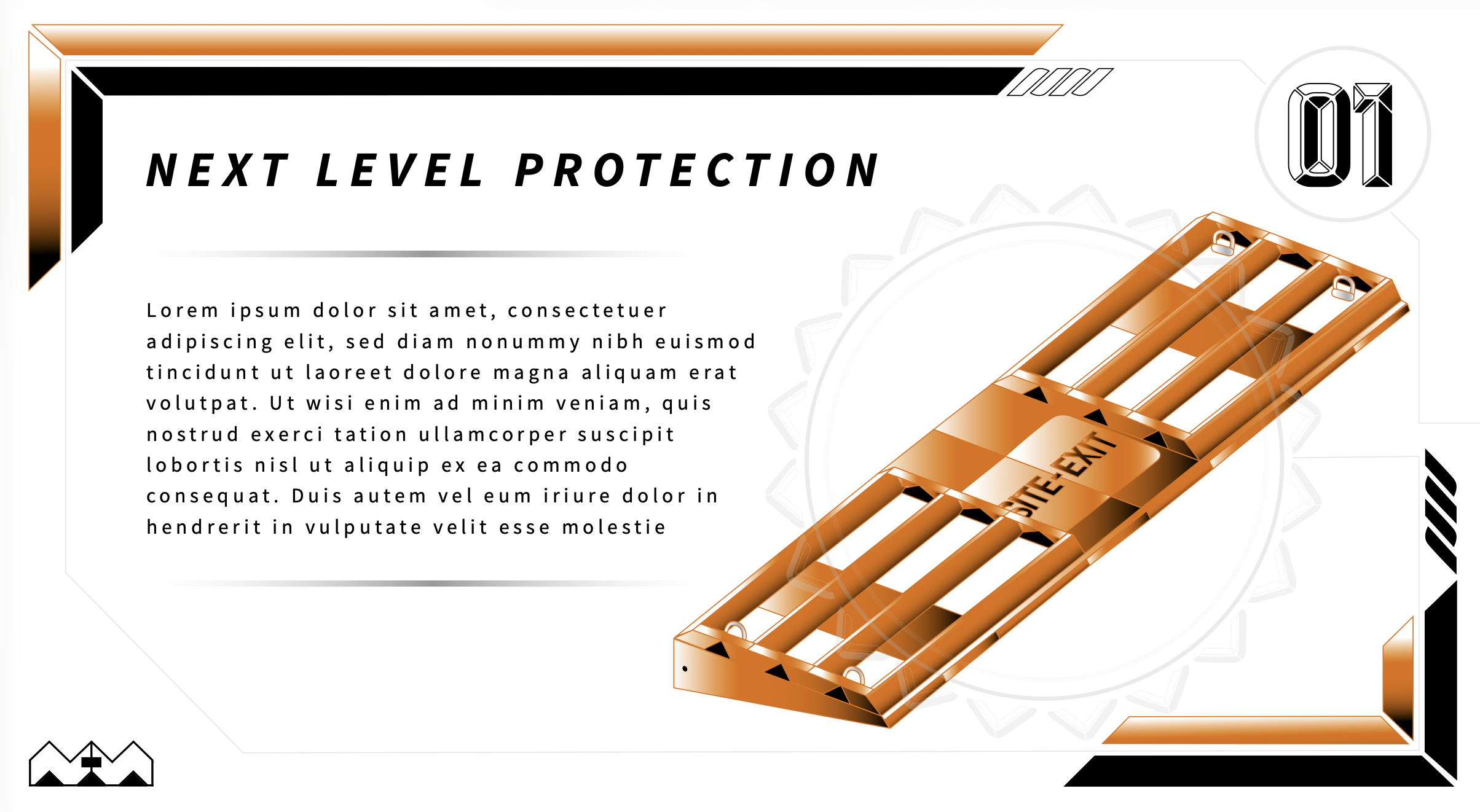
Above: Brand visual identity take two, designed with my client’s original logo in mind.
Brand Direction #2
My client felt conflicted by the new direction due to his and his company’s attachment to their existing logo, and asked if I could explore an alternate brand direction using the existing logo as inspiration. At first, I was intimidated by this request as I had redesigned the logo to make it easier to create a wider brand identity for my client in the first place, but soon found this to be an engaging challenge. The gradients and maximalism of my client’s original logo reminded me of the experimental design work of the 90s and early 2000s, so that gave me a new design philosophy to start from: delight in the capabilities of digital tools as much as possible, even if they are presently common place and not as exciting to onlookers as they once were. Use gradients, excessive layering, photo manipulation, and so on. Sometimes design is more about leaving a poetic impression than it is about legibility, after all.
Conclusion
My client was excited by the second visual direction and was interested in working with us at a later stage in the development of his business, however he did not return before PrintandPixel.com shut down. Even so, this project was an insightful exercise for me regarding doing brand design for clients who have brand elements that they do not wish to update when they update their brands. It taught me how to meet existing brand elements where they are at, analyze the visual styles they take inspiration from, and create unique solutions when there are not existing brands to use as reference.