
PrintandPixel.com
Background
When my local print shop chain got bought up, the new owner wanted to do a rebrand. I was hired to help with the rebrand and stayed on as an in-house graphic designer who was also in charge of social media and marketing. I produced a substantial amount of branded materials for this project over the course of a year: forms, flyers, social media posts, newsletters, signs, and more.
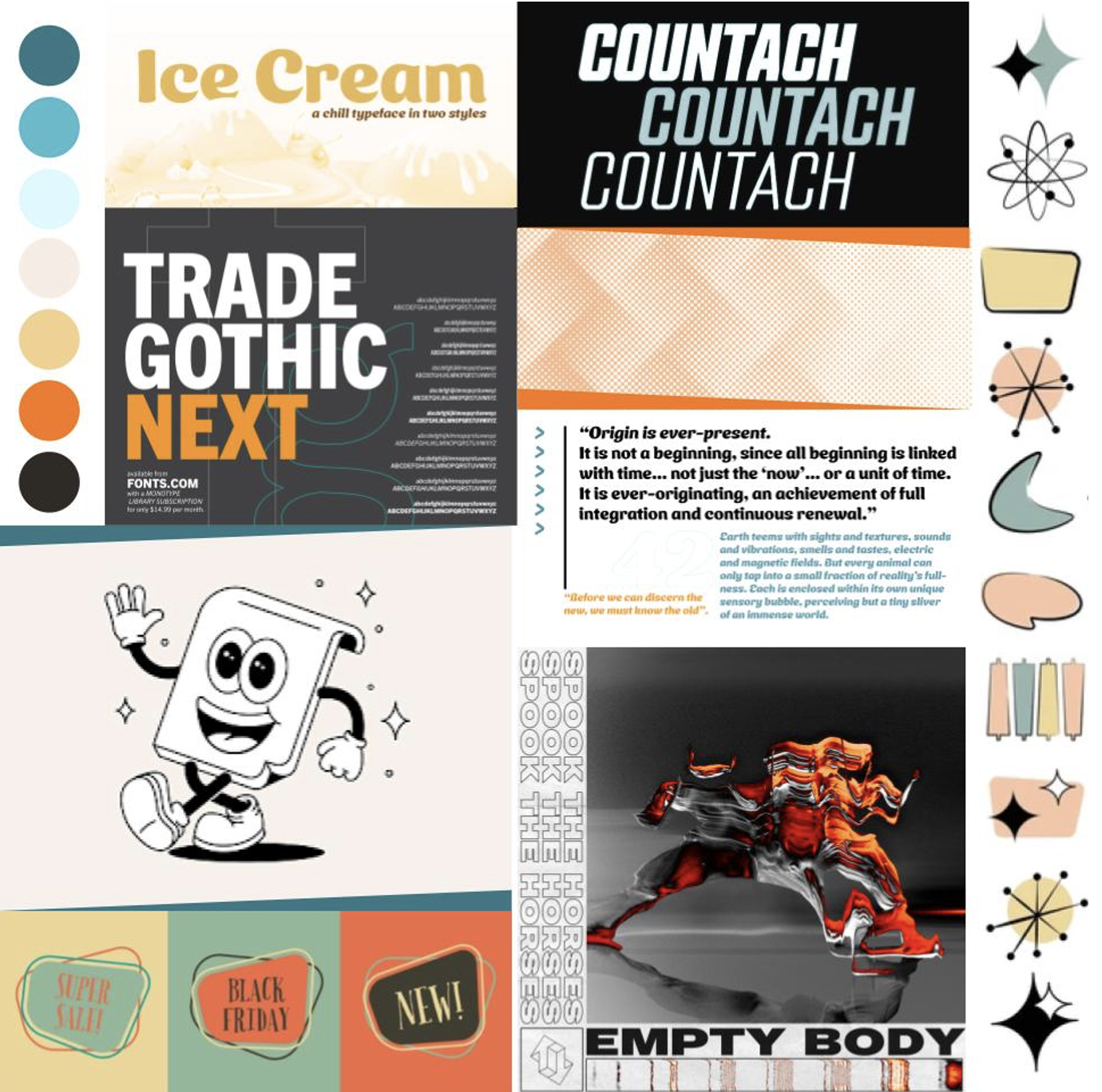
Above: PrintandPixel.com mood board.
Visual Identity
PrintandPixel.com was a family run business and it’s primary customer base was older people who believed in supporting local businesses. This older demographic also saw the people who worked at our stores as a kind of tech support, a place where they could go where technologically inclined people could help them with design applications and other computer problems that were unfamiliar to them. This set up PrintandPixel.com’s visual identity to be simultaneously nostalgic and contemporary. Nostalgia to remind customers of a time when friendly local businesses were the norm and to associate us with them. Contemporary to show that we are with the times and capable of solving modern problems.

Above: PrintandPixel.com logo. Mascot created by Michael Brown and typographic design by Kelly Carmichael.
My boss wanted a retro rubber-hose style mascot for the logo and I supported this direction on the grounds that mascots have been long time staples of friendly small town branding. My co-worker’s typography choices for the logo influenced my decisions for the rest of the brand’s visual identity development. The usage of the Ice Cream font associated our brand with the 1950s, and Countach brought us into the contemporary era. What connected the 1950s and 2010s styles in my mind was an optimism for technology and the future, which matched my boss’ ambitions for his business’ expansion in this digital era.


Above: PrintandPixel.com posters using the orange and teal style variants. The paper planes hint at the fun and friendly side of the brand’s identity.
I began to develop the main visual identity by designing layouts for advertisements, like posters and flyers. Slanted wording, abstract shapes, and sparkling illustrations were tied to the 1950s inspired aspects of the brand, while a halftone dot pattern connected to both the print side of the brand as well as the friendly, comic-like aspect of its visual aesthetic. Colors were selected from 1960s to 1970s retro advertising. The aim was to create a look that generally evoked the idea of retro and nostalgia without needing to be too specific to a particular time period, though overall, 1950s motifs had the strongest influence.
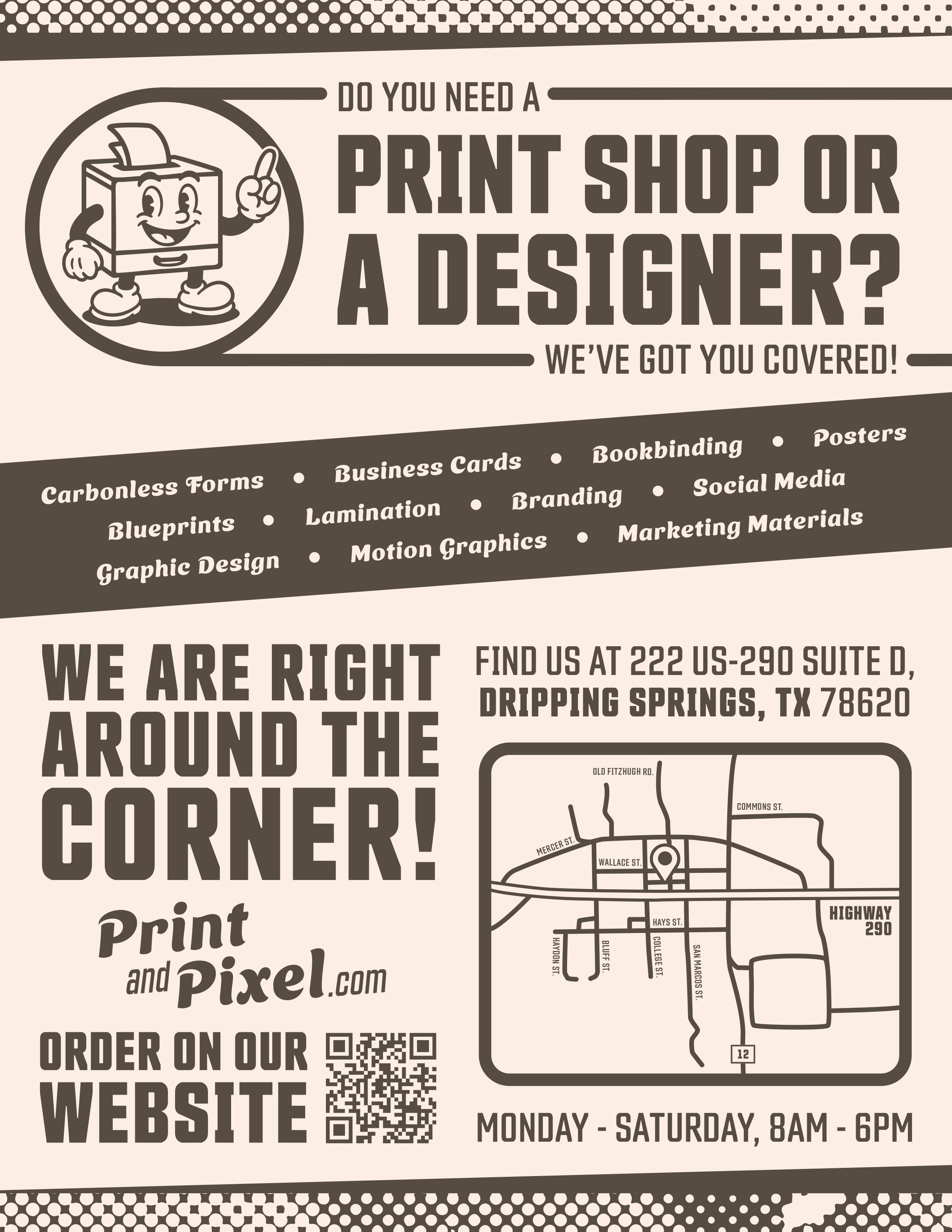

Above: PrintandPixel.com flyers monochromatic style variant.
The halftone dot pattern was most pronounced in the brand’s monochromatic style variant. Rather than black and white, media in this style would be beige and brown to evoke faded paper prints, and at times we would print dark brown ink onto specialized papers rather than use the brand standard beige as a background. My Black Friday ads were inspired by this “faded black” design philosophy, representing a subtle visual pun through a brown-as-black ad background.


Above: Email marketing campaign layout examples. Please note that the content went through multiple iterations, so the corresponding social media posts shown feature different content.
Email Marketing and Social Media
One of the longest projects I worked on during my time at PrintandPixel.com was an email marketing campaign with corresponding social media posts. I worked with my boss to plan out a campaign story and created templates that could be reused for specific circumstances, as well as adapted my email marketing campaign files to work as social media posts. Our objective was to reintroduce the re-branded print shop to it’s pre-existing customer base, establish ourselves as real people who wanted to be a part of our local community and to subtly pitch our newsletter and social media as a places where people could stay informed about sales and special announcements (this was based on my research into industry competitors’ social media accounts and the various ways they were able to gain a large following).
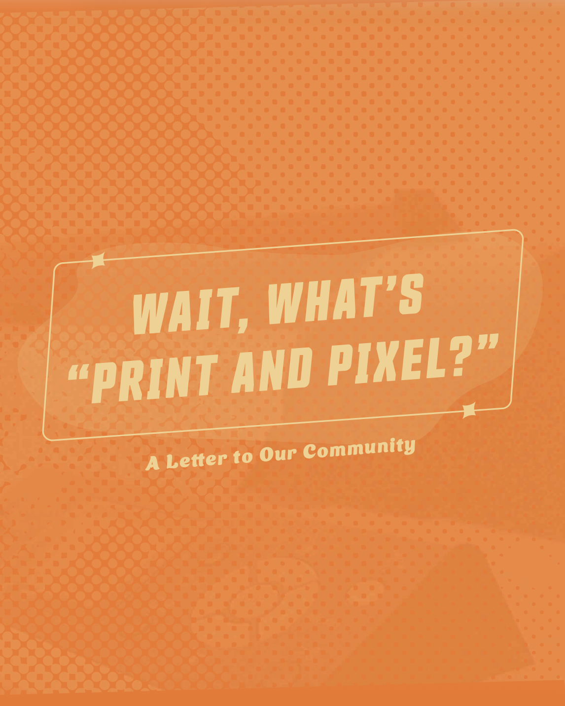
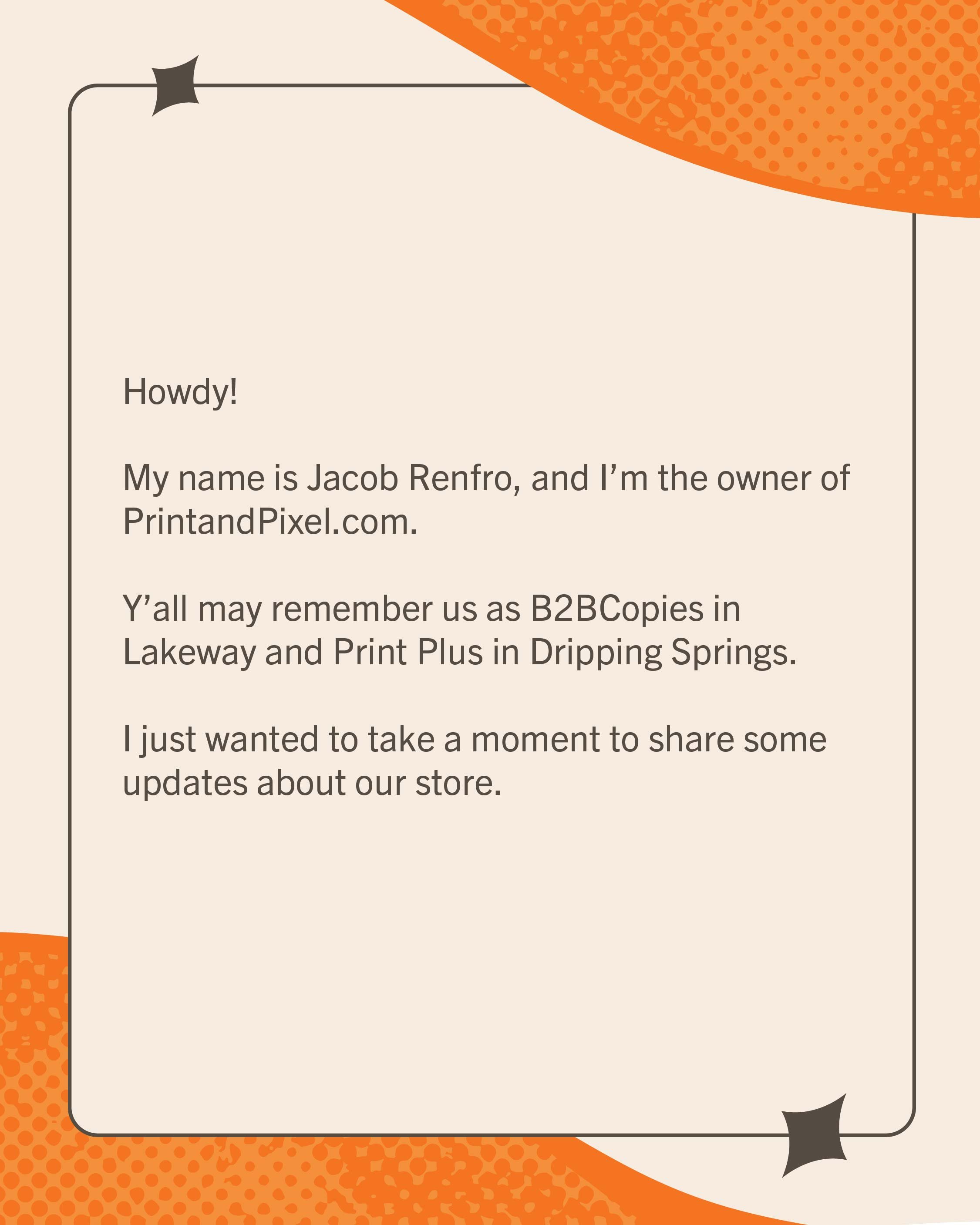
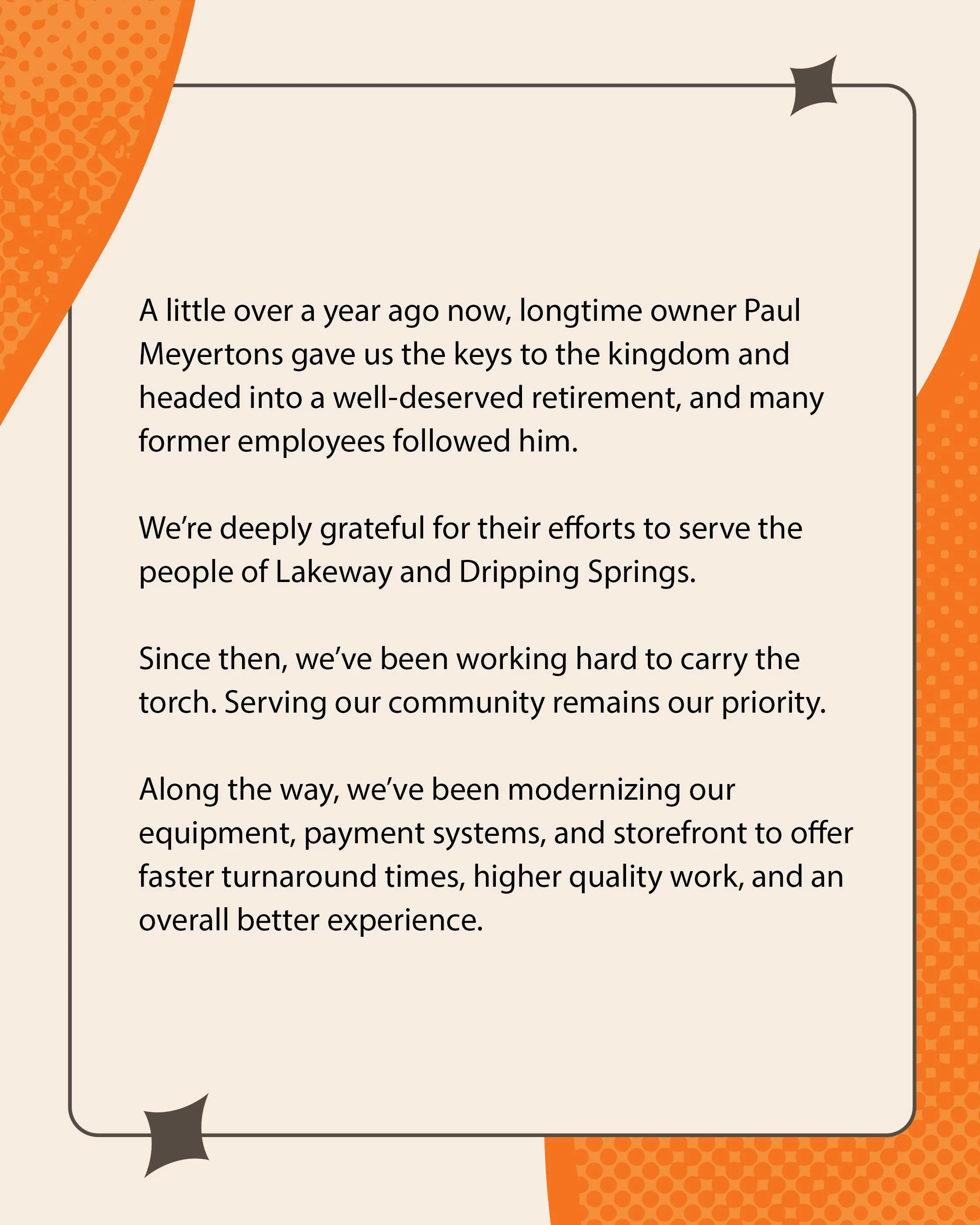
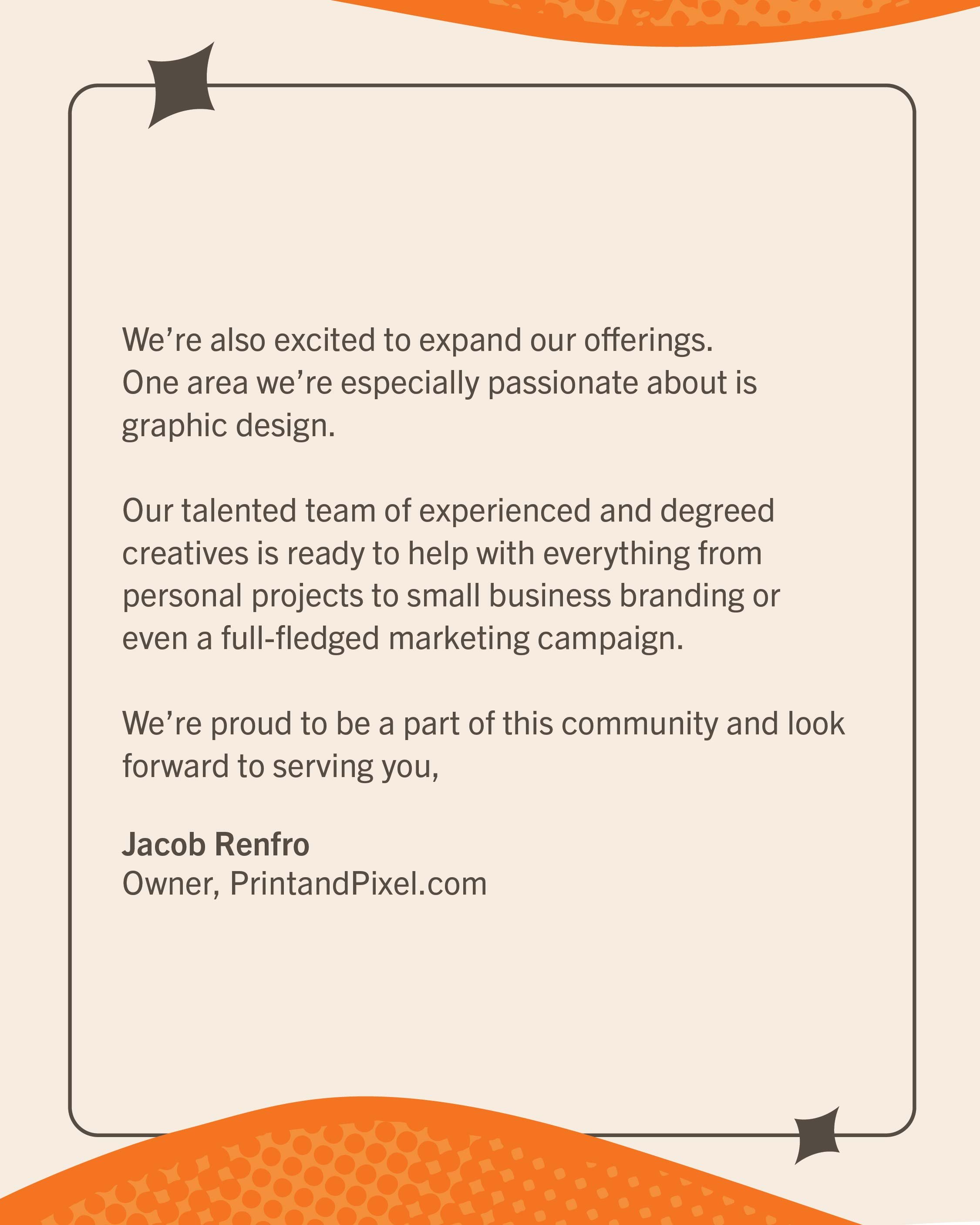
Above: Instagram carousel adaption of the email marketing campaign’s “Letter to Our Community”
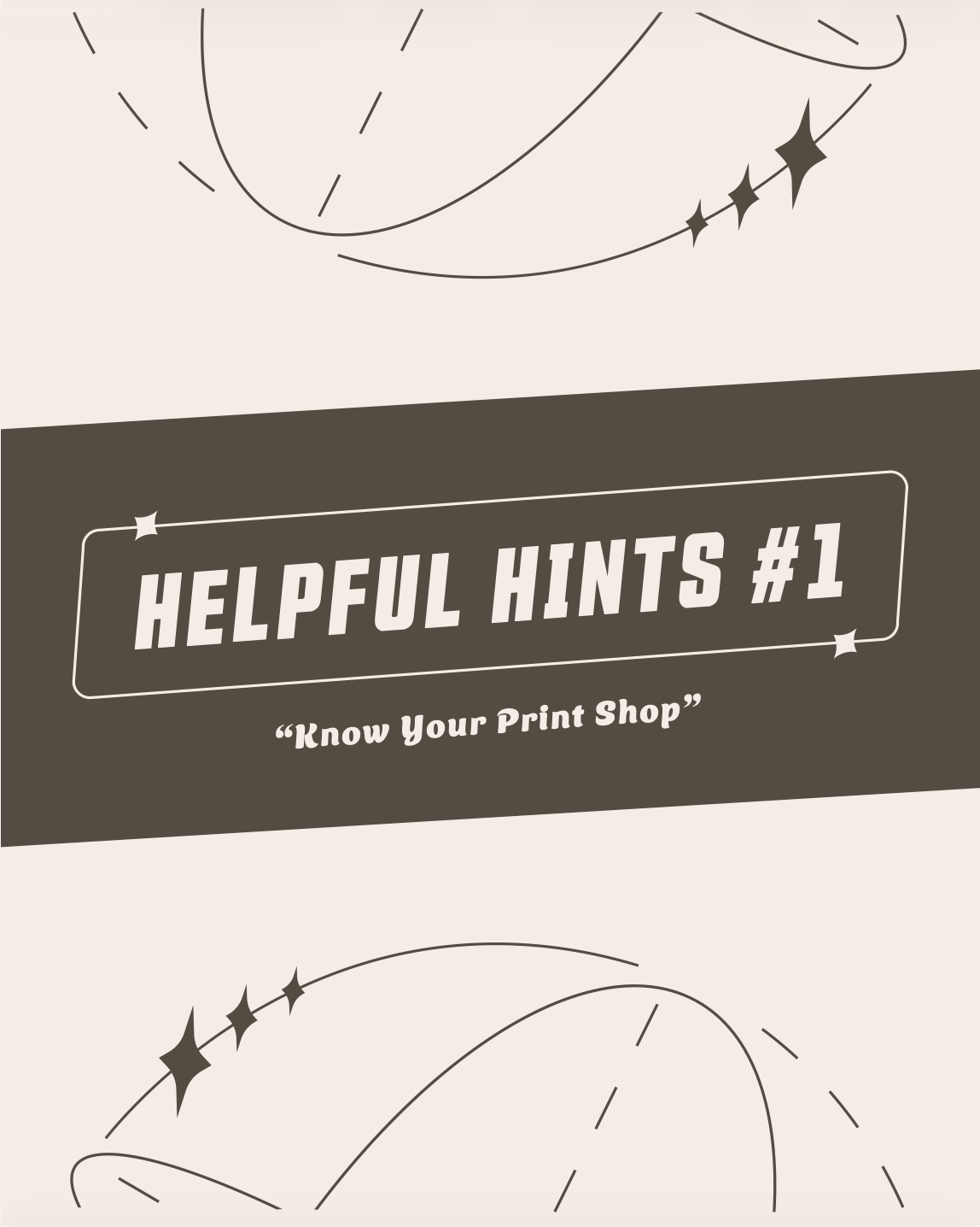
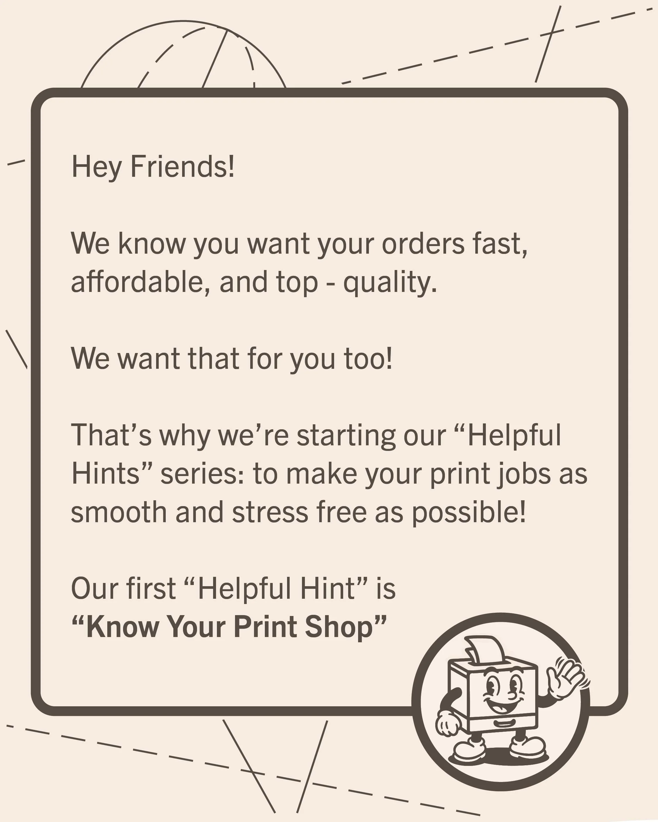
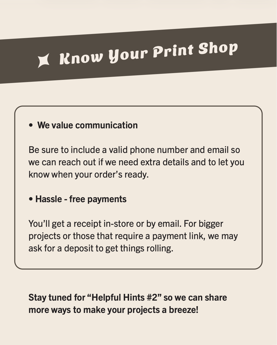
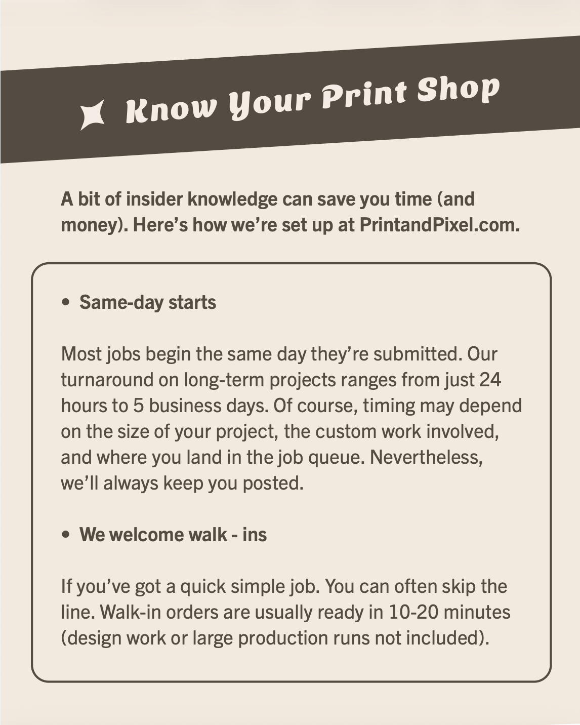
Above: Instagram carousel adaptation of the email marketing campaign’s “Helpful Hints #1”
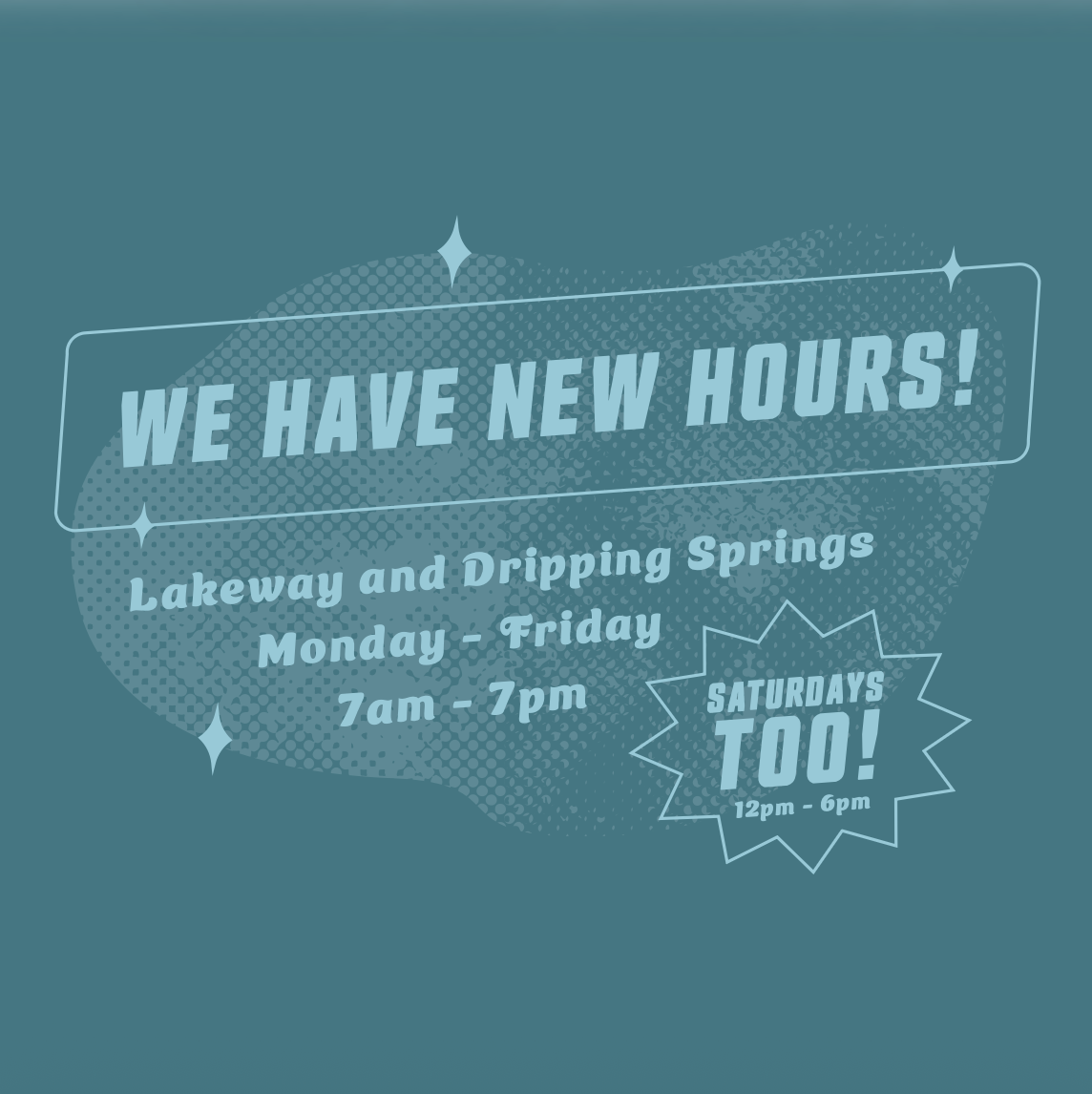


Above: Various announcements from the email marketing campaign reformatted as social media ads.
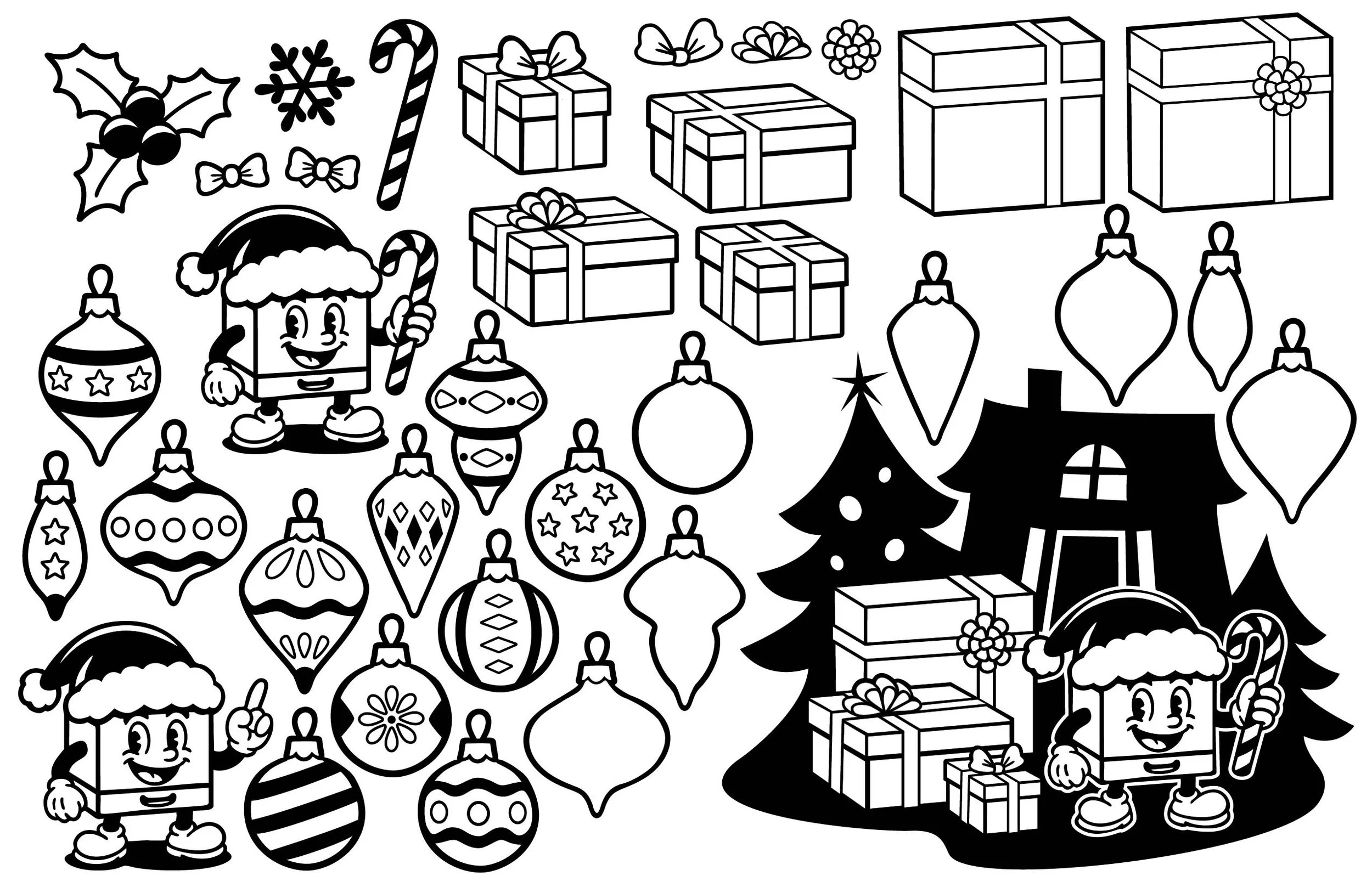
Above: My prop sheet for PrintandPixel.com’s Christmas campaign. The silhouettes were inspired by the 1950’s Mid-Century Modern illustration style.
Additional Illustrations
One of the most fun aspects of my job at PrintandPixel.com was getting to create illustrations for special campaigns and events. Holidays in particular allowed me to flex my illustrator muscles. Sometimes I asked Michael, who created our mascot, to draw me a couple of sample objects in the same art style as the mascot so I could use those as reference for my props. For example, I asked him for a sample ornament for our Christmas campaign, and created a collection of ornaments based on that sample.
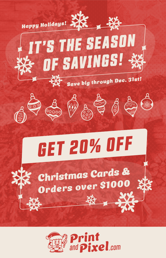
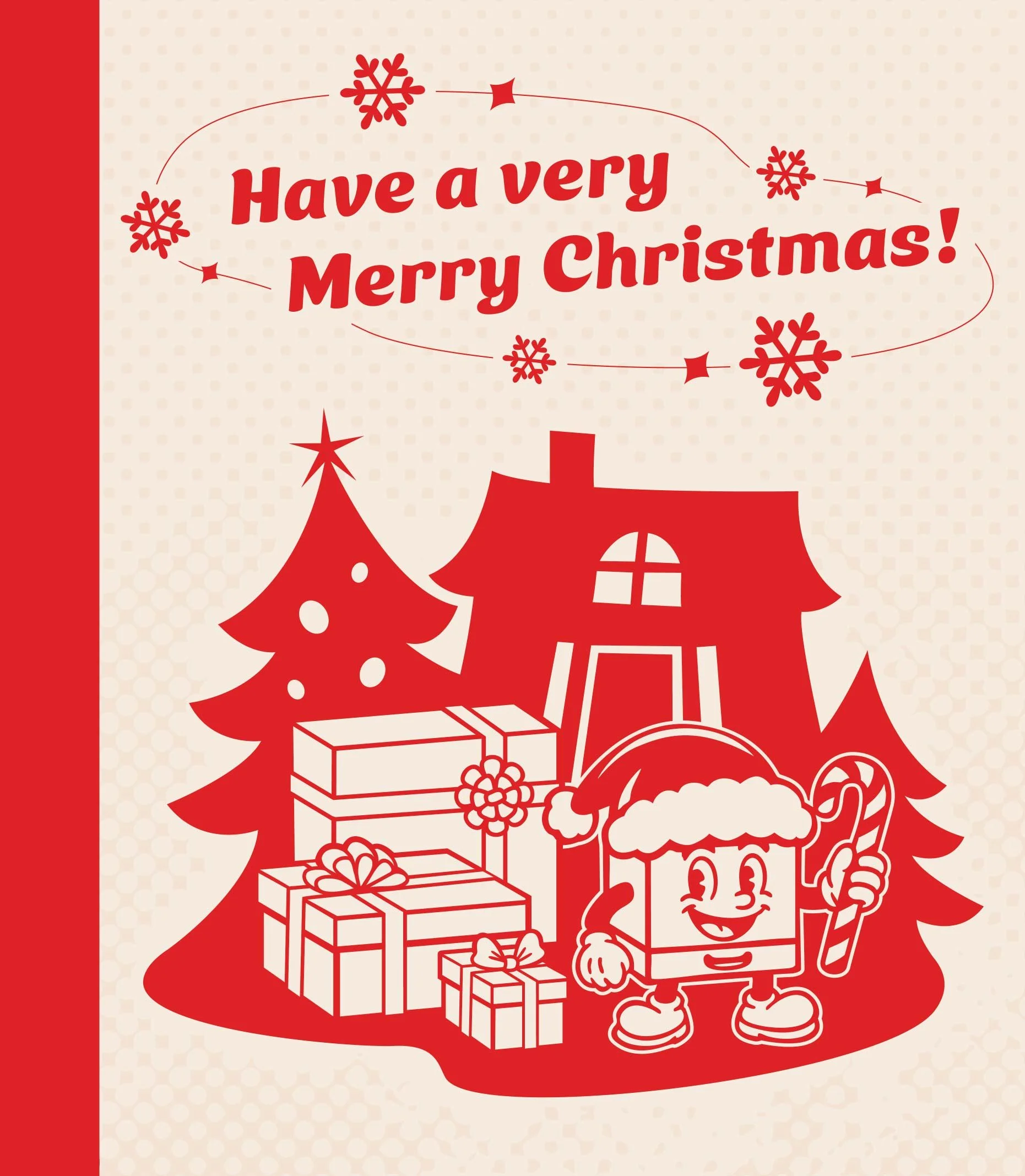
Above: My illustrations applied to a flyer and a Christmas card. The spine of the Christmas card takes inspiration from retro children’s books.
Conclusion
My time at PrintandPixel.com represents a significant learning experience for me as a designer. Not only did I get to work in a wide variety of new mediums, I was challenged with creating styles and templates that would be cohesive across a large, well developed branding project. Additionally, working as a print shop operator gave me invaluable insight into designing and preparing files for print, which helped me get better at designing for projects with a physical production process.

Above: PrintandPixel.com flyer. We would give these out with in-store pick-ups.